Pedigree Paper
Pedigree Paper Re-Brand
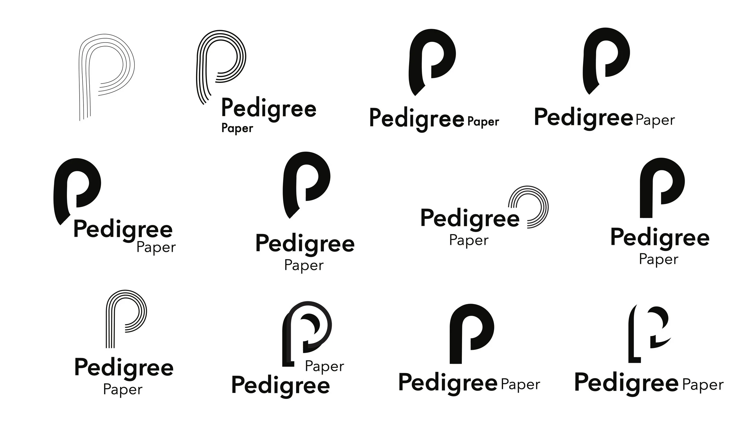
Here is the final Logo for the Pedigree Paper Re-Brand.
About
Pedigree Paper is the online retail division and sub brand of Ball and Doggett. They supply all paper and printable matierals. Their products are suitable for all occassions such as Arts, Craft & DIY, Branding, Industry Packaging and Occasions/Events. They’re a community inspiring all creatives to be limitless, and their employees all acquire the same positive attitude toward their customers as they intend on satisfying everyone’s needs as best they can.
Design Problem
Require a clean, fresh and modern appearance
Must stand out and have a strong presence about it, while still appearing professional
Must appeal to the design community and high end clientele, although still be aproachable for the DIY market.
An evolved brand must be created, appearing bold and ambitious, while maintaining a level of professionalism and an up market feel
Must appear as it’s own entity, while still being related to the Ball & Doggett
Original branding appeared outdated which had the potential to lose customers to more modern and updated brands.
Original branding didn’t reflect their current values as a brand.
My Role
My Role was to execute the entire re-brand for Pedigree Paper, using my skills with the Adobe suite.
I studied the design brief and underwent the whole design process in order to achieve the final concept.
The time limit for this project was 5 weeks, therefore limited time put pressure on to achieve an adequate final solution.
A constraint for this project was that Pedigree Paper is a sub brand of Ball & Doggett therefore there was some guidelines to follow.
Final Solution
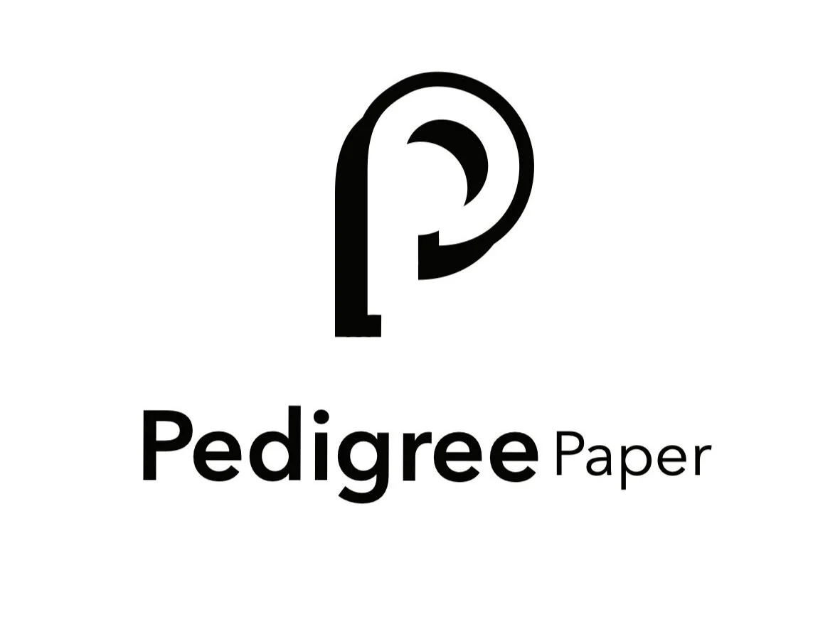
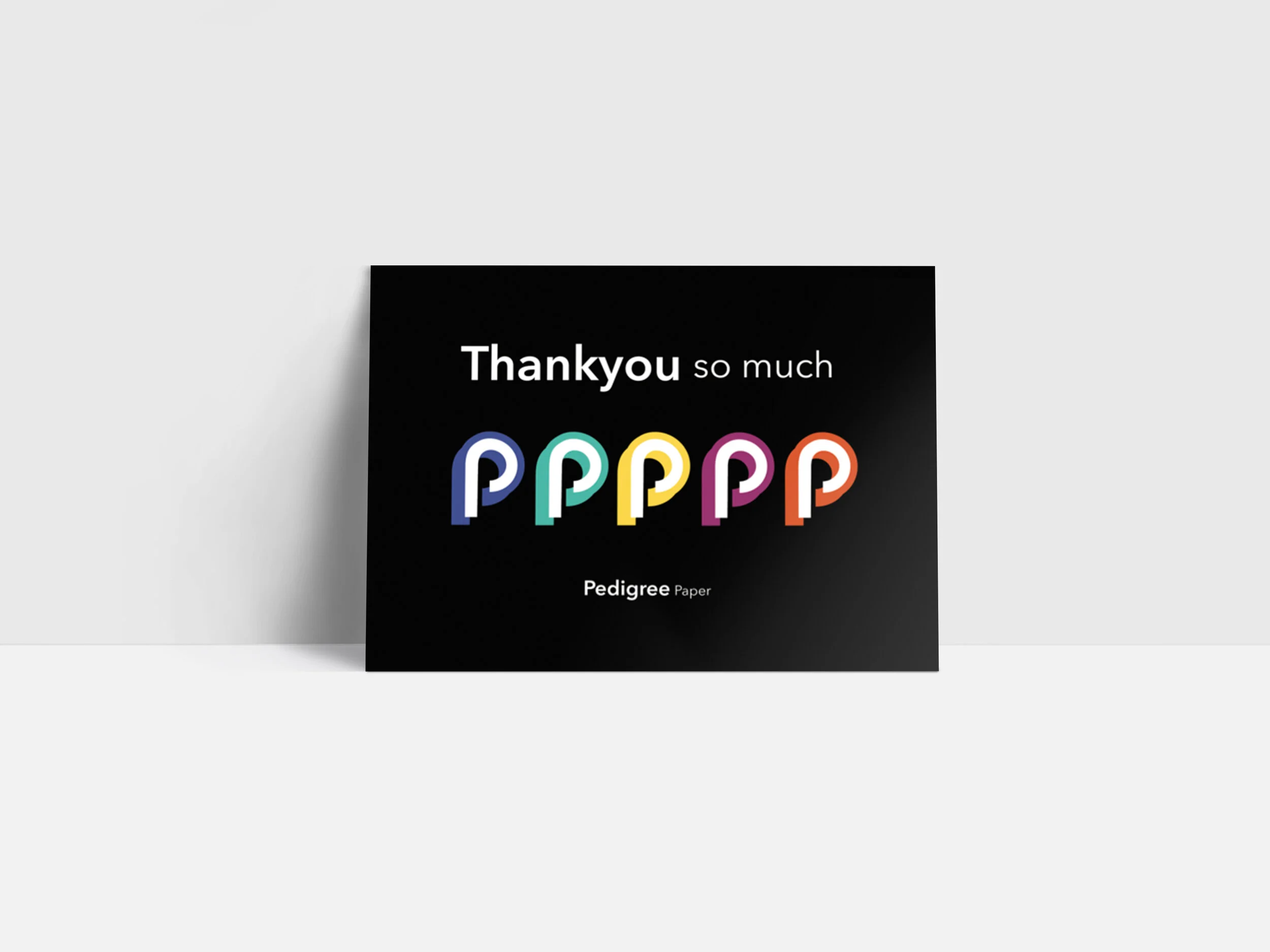
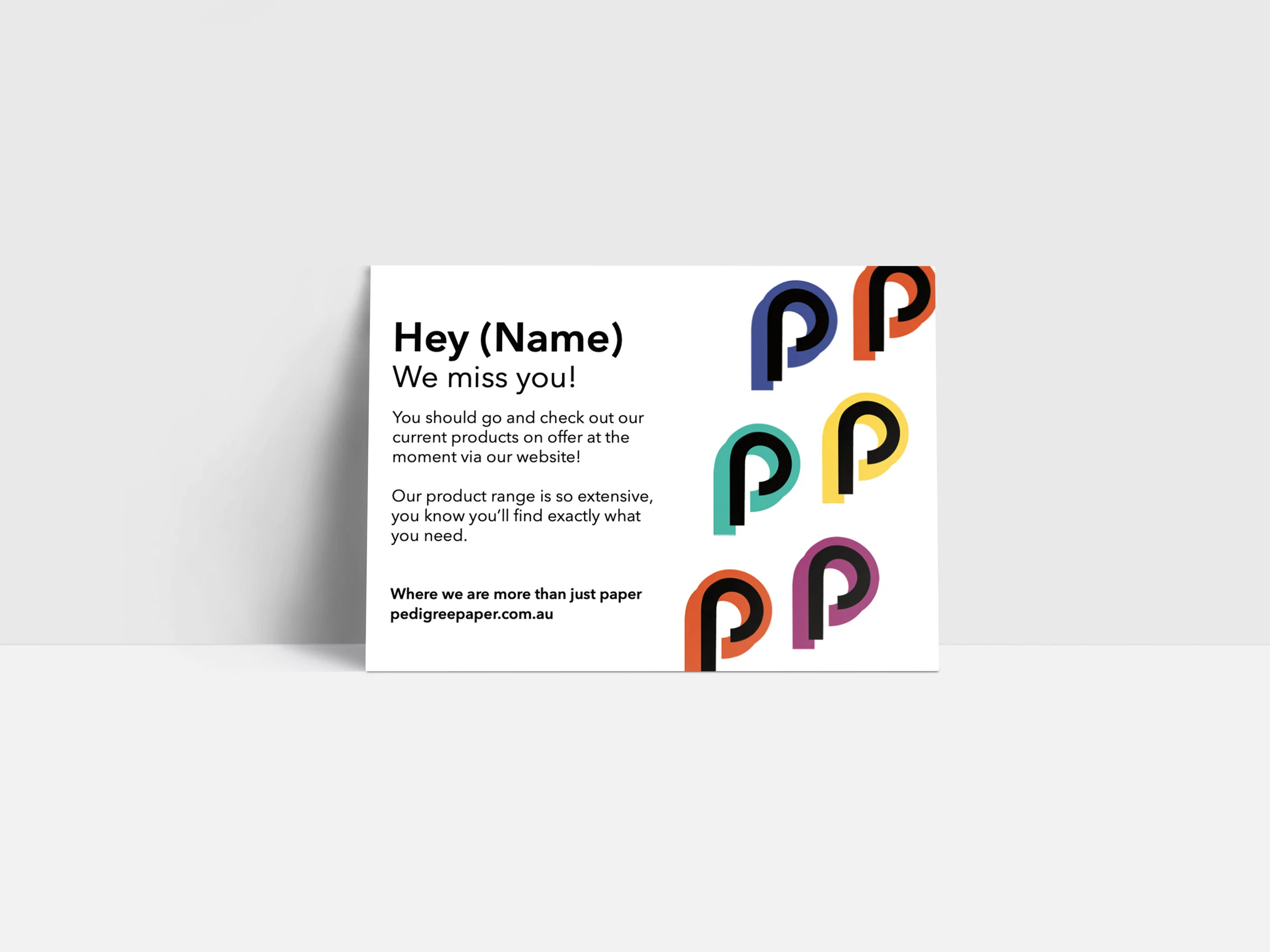
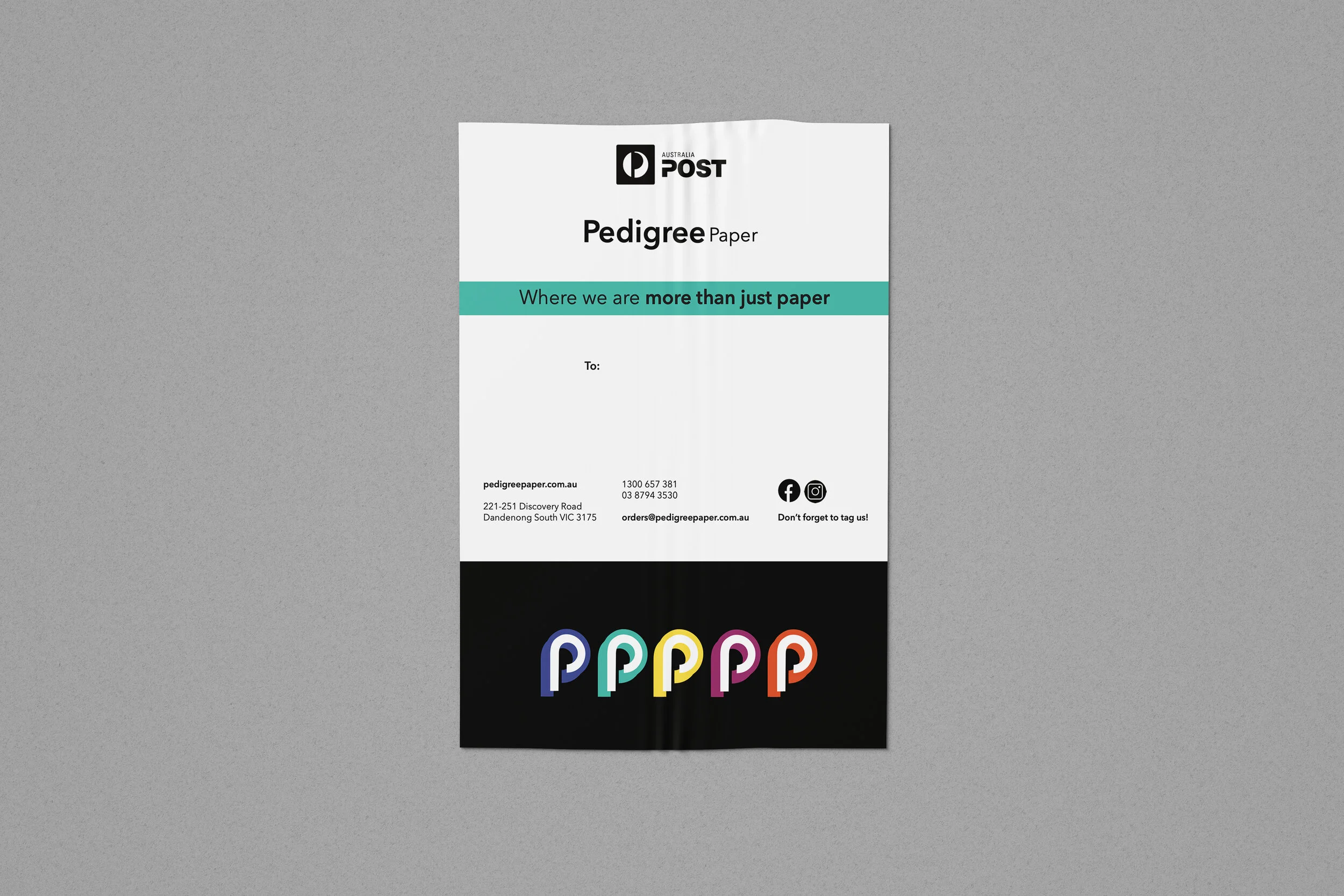
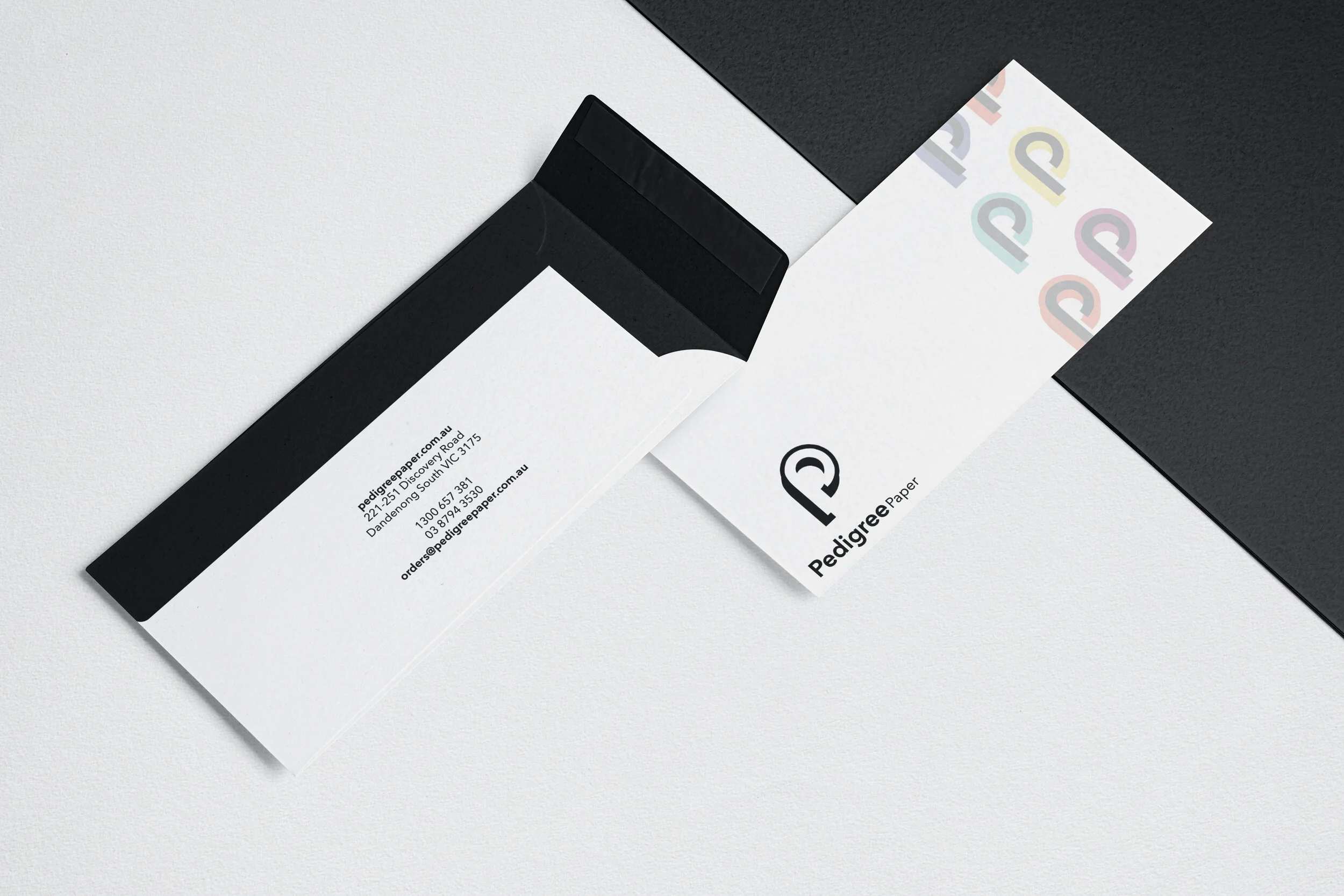
The final concept for Pedigree’s new brand identity represents a roll of paper while also acting as the letter P.
This represents the services of Pedigree Paper with a dual meaning.
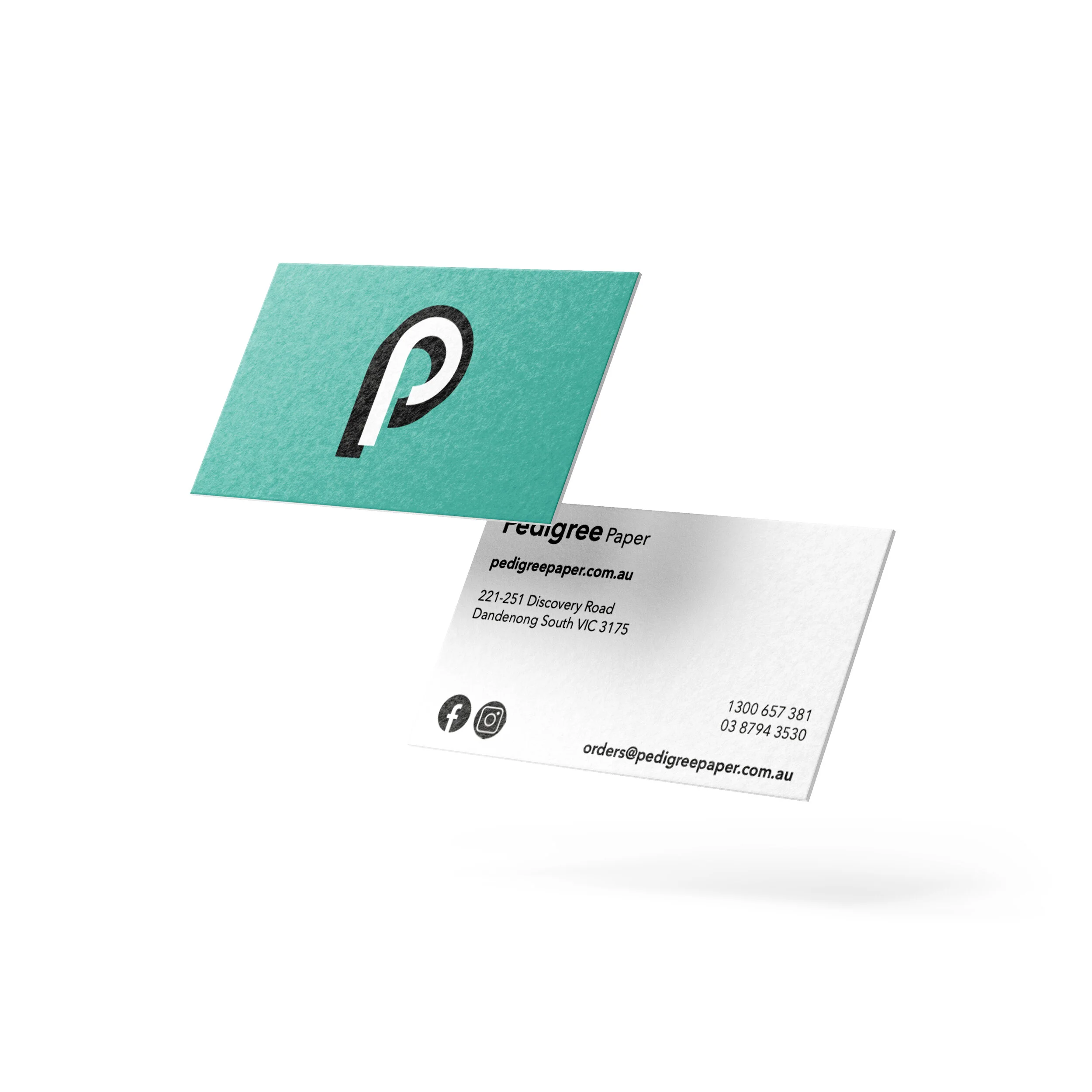
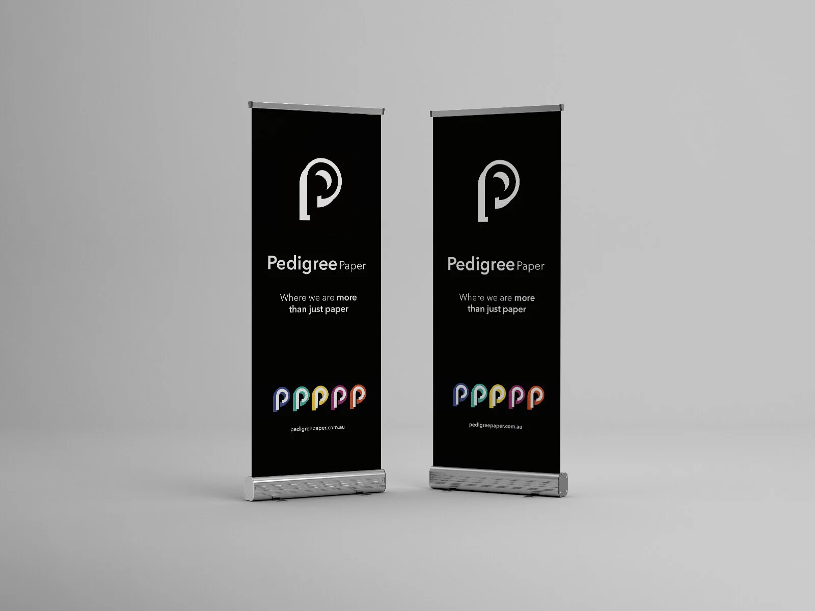
The logo is presented in black and white as this a large part of the Ball & Doggett brand although colour can be implemented to either element of the P throughout the promotional material.
Due to its clean presentation it will be applicable to every surface that it’s presented on.
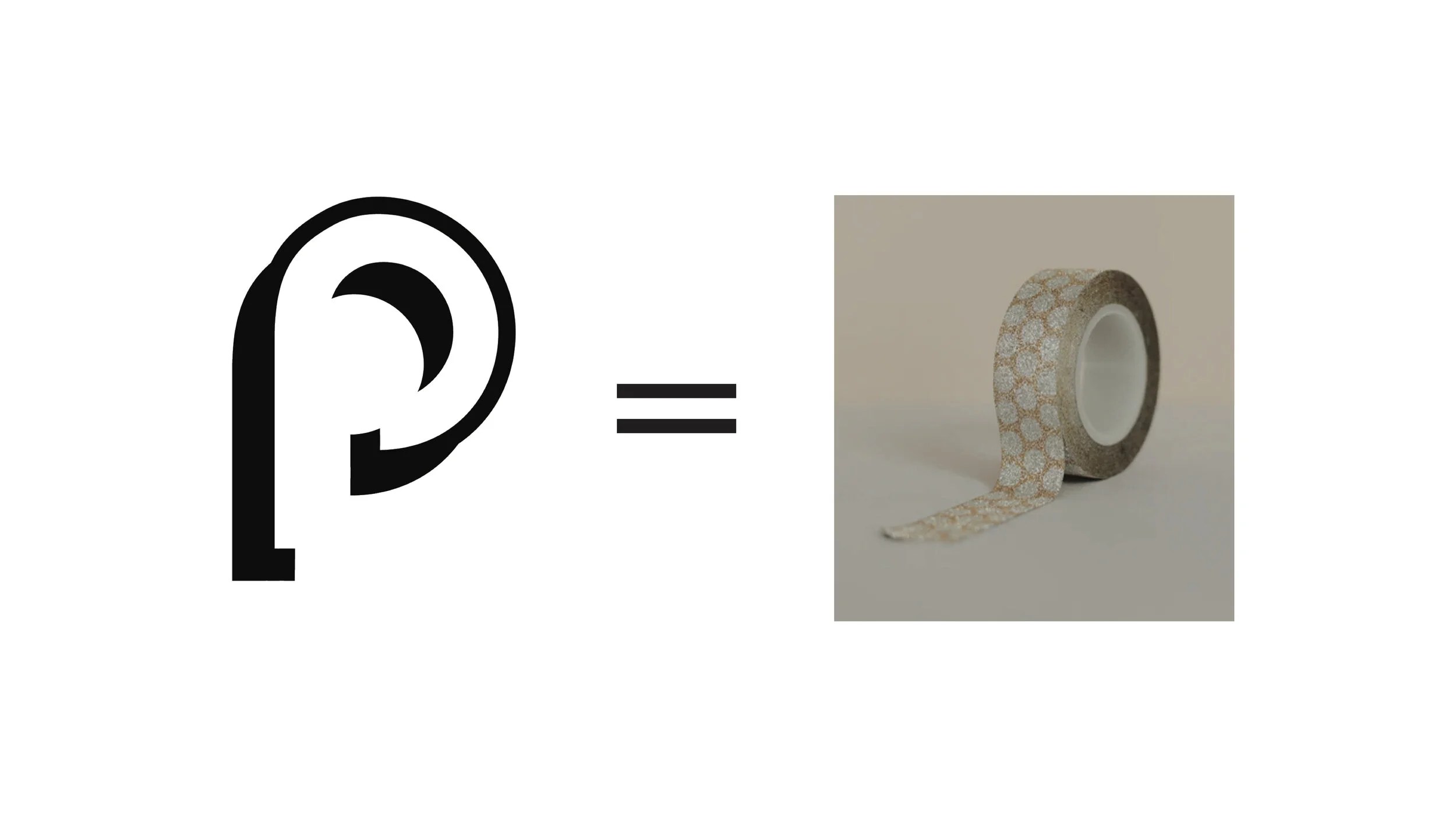
Here is a comparison of the P mark with a roll of paper, as this is the depiction I was aiming to achieve.
Design Process
In order to achieve the final outcomes, thorough research into the components of the brief was required. I explored the client, audience, competitors, constraints, colours and typography.
Following this, visual research and sketches were completed in regards to three separate ideas to ensure all possible solutions were explored.
I then began the digital development of my chosen sketches, using Adobe Illustrator ensuring every concept had been pushed as far as possible.
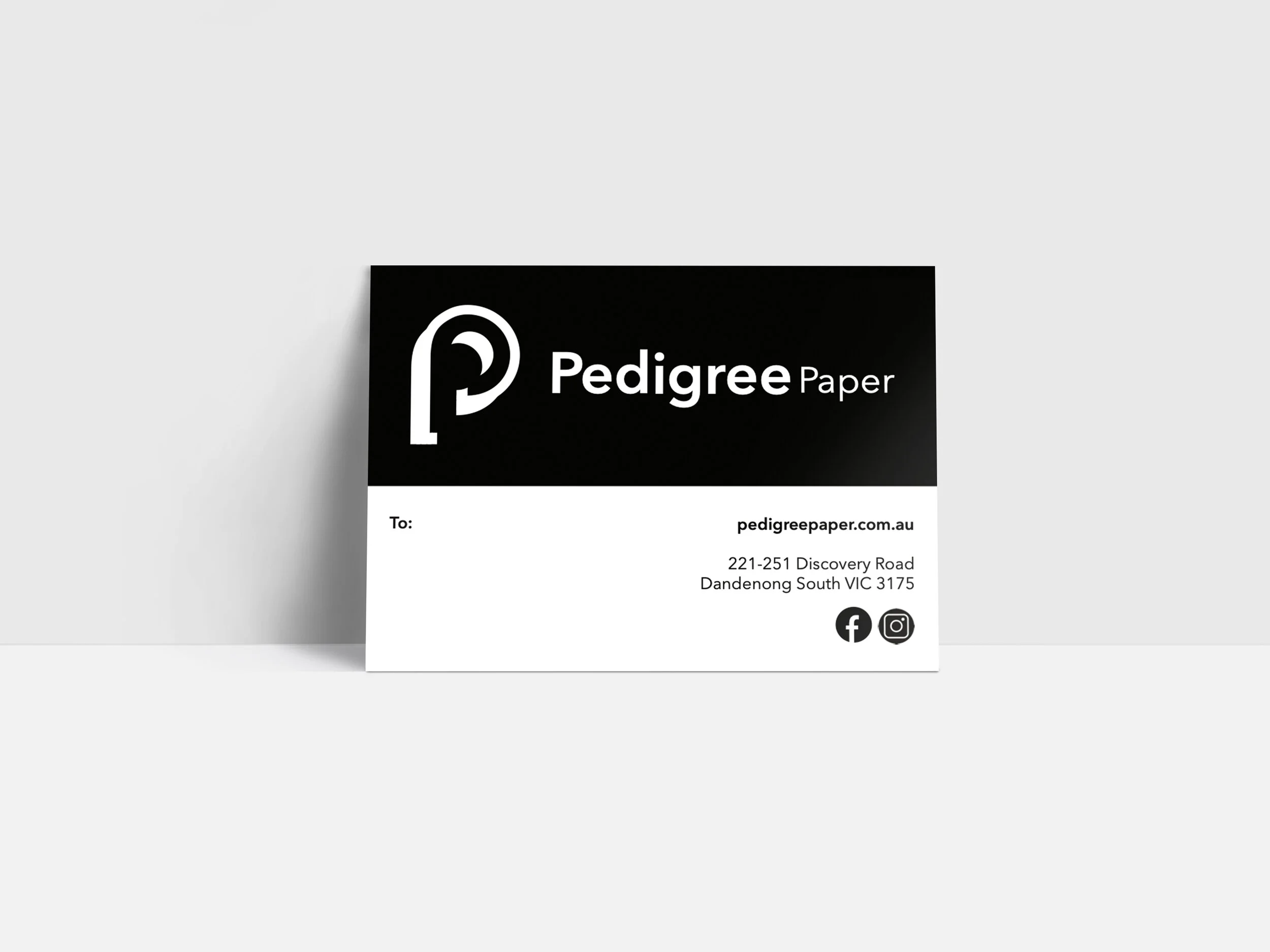
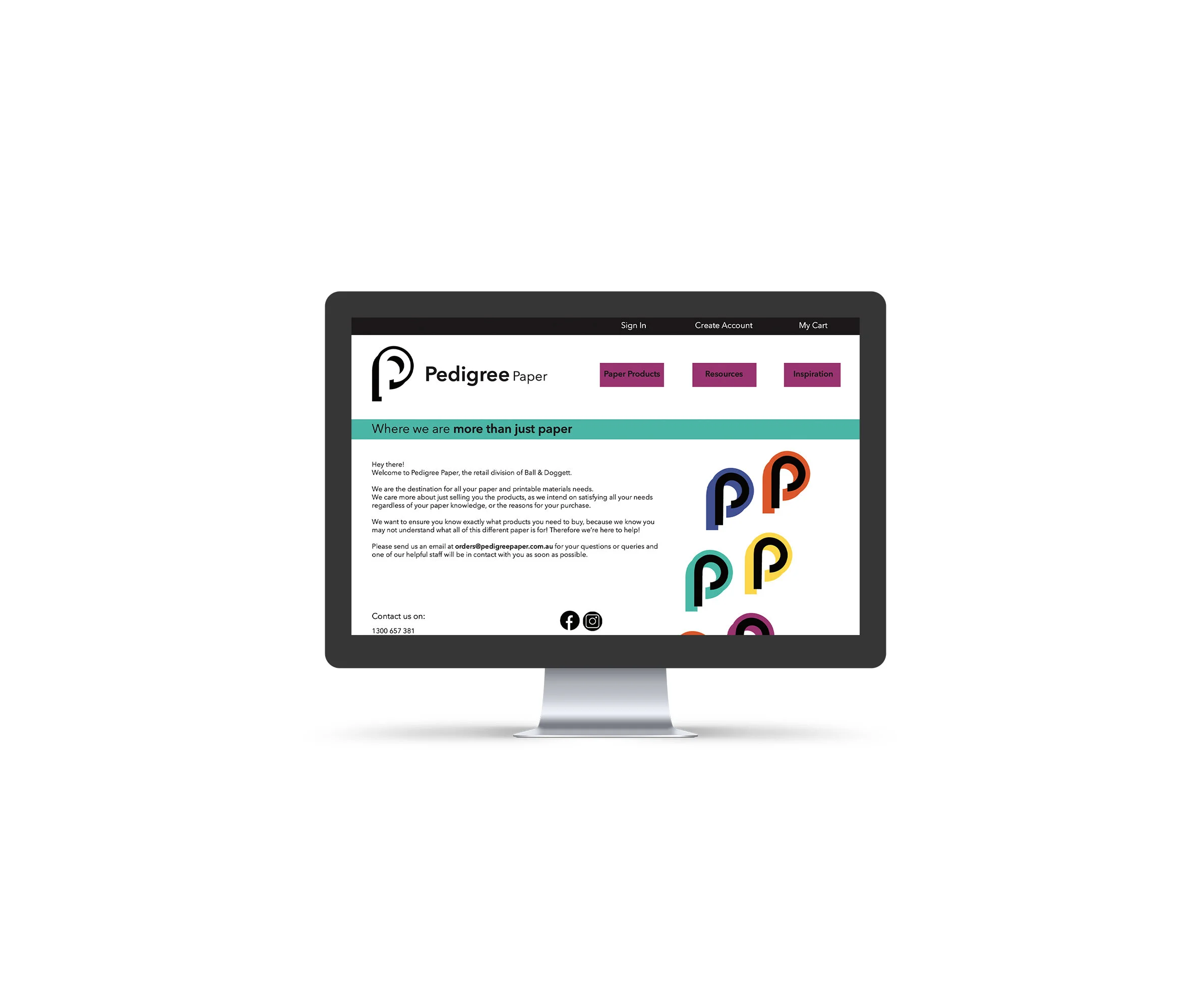
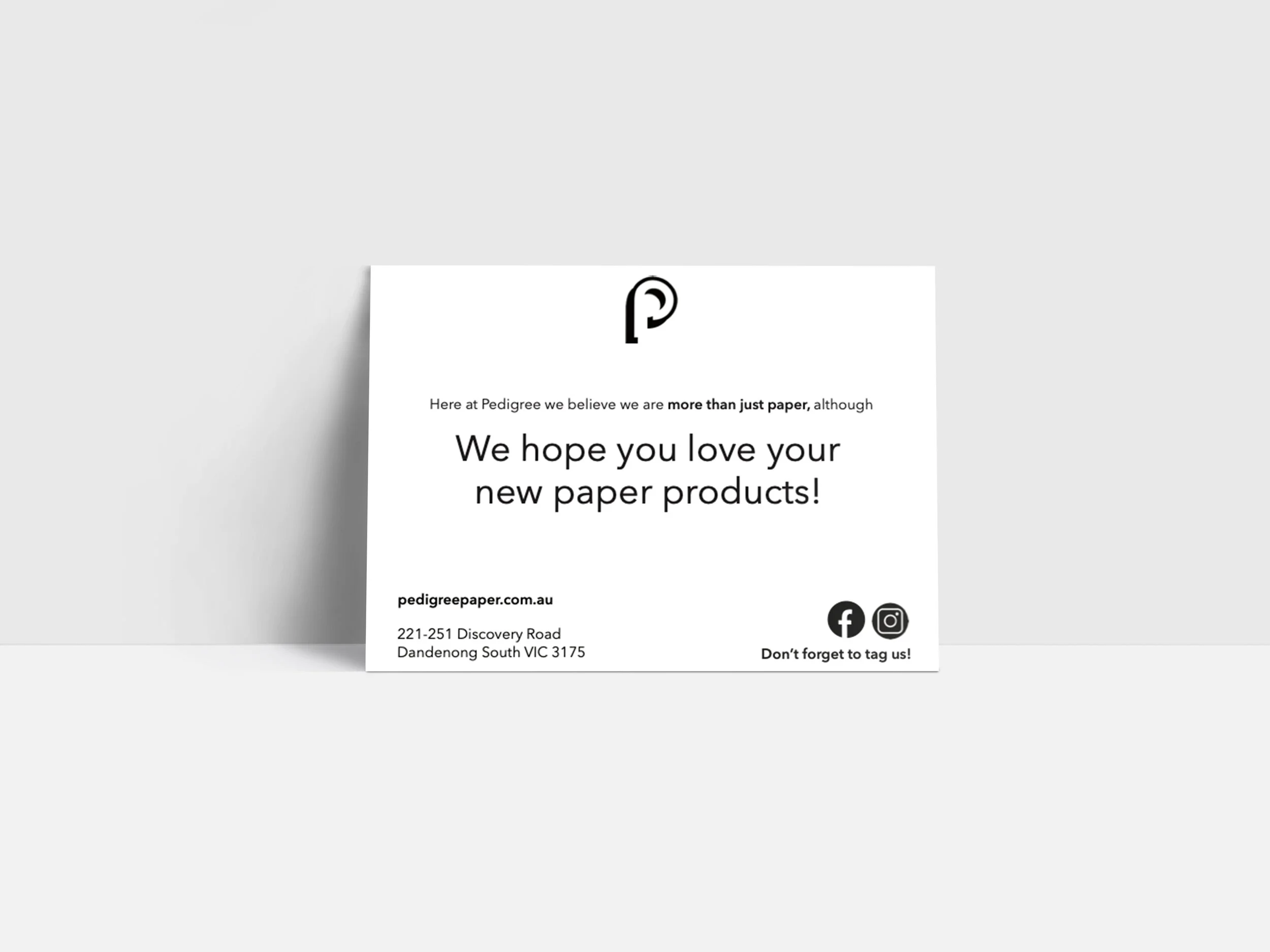
After developing all potential options, I began refining my final concept. Once the brand identity was refined, I was then able to develop and refine all promotional materials for Pedigree Paper.
A style guide was then produced for the client and a Pitch was prepared.
Results
Following the entire design process, I knew that this was the most effective solution due to its ability to represent the brand with a dual meaning.
With it’s clean presentation and versatility it is applicable to every surface that it’s presented on.
The brand application of this logo explores different positioning and rotation of the icon to allow it to be more sucseptable and a distinctive mark for the brand.
The implementation of colour to either the black or white part of the logo, showcases the fun and inspirational aspect of Pedigree Paper, attracting creatives.
Key Learnings
Throughout the completion of this project I experienced a lack of ideation and had an inability to overcome this. I had seen their new solution on their website therefore I couldn’t generate my own ideas based on already seeing the ‘solution’.
I was able to overcome this problem by listing what I liked about their current branding and what worked, then also listing what I felt could be improved on and how I felt it could be done slightly more effectively.
After hitting this mind block, I shifted my focus on key parts of the brief that resonated with me, and I felt that this was the main way that I overcame this problem.
This project also allowed me to become very confident with using mock ups, and presenting work to a client through a style guide and pitch presentation.
Conclusion
Overall, I believe this project is the most successful one I have completed to date, as I felt it reasonated with the brief really effectively, with thorough research all throughout the process.
The promotional material has a really coherent appearance and ultimately allows the brand to showcase their professionalism with the use of clean black and white lines, while also appealing to a DIY market with the use of fun colours.
After this project I feel confident taking on any further branding and design projects, and would love to work with any other businesses/companies needing a similar project completed.
Thankyou so much for your time!